A visual guide to printed dots

Comic book dots: what they are called and how they work

Comic book dots are commonly called Ben-Day dots, halftone dots, or screentone. Those names describe related looks, but they do not always describe the same process. This guide shows the visible difference and helps you choose the right tool for a flat pattern or a shaded image.

Original visual comparison

Uniform pattern or tonal image?

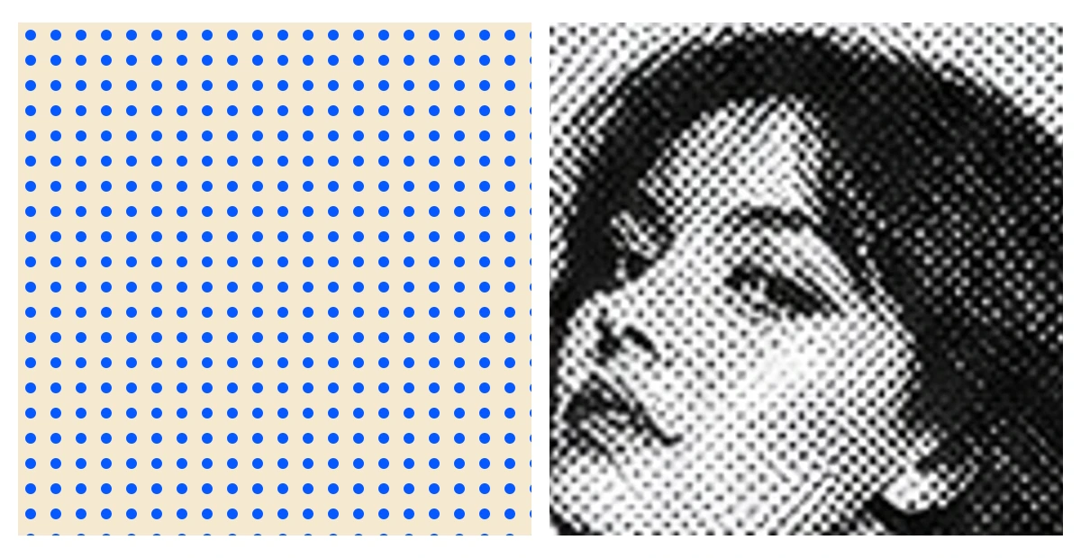
Compare what the dots carry: a repeating surface on the left and image detail on the right.

Uniform comic dots beside an image-based halftone portrait
Uniform comic dotsSame point size and spacing across the field, suitable for a tint, panel, or repeatable texture.Image-based halftoneChanging coverage describes the portrait when the source image must remain recognizable.

Look closer

What are comic book dots called?

The short answer is Ben-Day dots or halftone dots. Ben-Day dots are the familiar regular fields of small marks associated with inexpensive color printing and the graphic language of vintage comics. A halftone is a broader method: it represents light and dark with areas of ink and paper, often by changing the apparent size of dots across an image. In everyday design conversation, people use both names for dotted comic effects, so the picture matters as much as the label.

Screentone is another useful term, especially for a ready-made sheet or digital texture placed over artwork. Stippling describes marks placed individually or irregularly, while dithering arranges pixels or small marks to simulate unavailable tones or colors. These techniques can all look dotted when viewed up close. Ask whether the marks form a uniform repeat, describe the tones of a source image, or are placed as individual drawing marks; that distinction usually identifies the useful workflow.

Look closer

Ben-Day-style dots and image-based halftones

A Ben-Day-style field usually keeps one mark size and one spacing across an area. The dots create a flat tint or a visible texture. If a blue dot field covers white paper, the eye blends the blue marks and white gaps at normal viewing distance. The same pattern can be clipped to a speech bubble, jacket, sky, or shadow shape without changing its internal rhythm.

An image-based halftone uses the source image to control ink coverage. Dark parts of a portrait receive larger marks, closer marks, or another higher-coverage treatment; light parts leave more background visible. The dots carry tonal information, so the face still reads even after smooth gray values disappear. Our comparison uses a regular field on one side and an actual portrait rendered with changing dot coverage on the other. It is an original working example, not a stock diagram.

Look closer

Read the visual comparison correctly

Look first at the regular panel. Every blue circle has the same diameter and every center follows the same grid. Nothing in that field describes a nose, an eye, or a shadow. Its job is to provide a repeatable surface. Then look at the portrait. Small light gaps remain in bright areas, while denser black regions describe hair, features, and shadow. The varying coverage carries the subject.

View the comparison both at normal size and close up. From farther away, both sides blend into areas of tone. Up close, one remains a uniform construction and the other reveals how the subject controls the marks. Screen scaling can create temporary bands or moiré in either regular grid. Check the source at 100 percent and at its intended display size before treating a browser thumbnail as evidence of a bad export.

Look closer

How comic dots create color and emphasis

A regular dot screen can create a lighter version of a solid color because some of the paper remains visible. Separate colored patterns can also overlap visually to produce additional colors and texture. In a modern illustration, you can use that logic without pretending to reproduce a historical press exactly: keep the palette small, let the dots remain visible, and use solid areas where the composition needs stronger contrast.

Dot size, spacing, and color each change the result. Larger marks at the same spacing cover more of the background and read darker. More columns in the same tile reduce the spacing and make the texture finer. A staggered layout breaks the strict vertical alignment of a square grid. Misaligned colored layers can create an expressive registration-shift effect, but intentional offsets should not be described as accurate print registration.

Look closer

Choose the right dotted technique

Use a regular comic dot pattern when you need a flat background, a color tint, a panel accent, a border, or a texture that can repeat across a large area. The pattern generator is the direct tool for this task because it starts from geometry rather than a photograph. You control the tile dimensions, grid density, shape, dot size, color, layout, and background, then inspect the repeat before exporting.

Use the photo generator when a face, object, or scene must keep its highlights and shadows. The source image decides where the marks become heavier. Use an overlay when the original artwork should remain intact beneath a separate transparent texture. These three workflows can appear similar in a small preview, but they solve different problems: make a repeating surface, convert tonal information, or add a layer.

Look closer

Make a comic book dot pattern

Open the pattern maker and begin with a transparent background so the artwork beneath the dots remains visible. Choose a tile size for the exported file, then choose the number of columns. At the default 512-pixel tile with 16 columns, centers are 32 pixels apart. Set the dot size as a percentage of that spacing. A 40 percent value makes each circle 12.8 pixels wide before rasterization.

Use Grid for straight rows or Staggered for alternating rows. Pick Circle for a familiar screen, Square for a harder pixel-like field, or Diamond for a more angular rhythm. Change the dot color and inspect both the single tile and the repeated preview. Download SVG when you want editable geometry or PNG when you want a ready-to-place raster tile. Test the exported tile in the actual layout before filling a large final canvas.

Look closer

Use comic dots without losing readability

Keep small text on a calm area or a solid panel. Dense dots behind thin letterforms can reduce contrast, especially on a phone. Preserve faces, hands, and speech balloons by masking or lowering the pattern coverage around them. If a dotted region competes with the focal point, change the mark size or crop the pattern rather than relying only on opacity.

For print, the on-screen pattern is design artwork rather than a press specification. Physical results depend on the printing method, paper, ink, resolution, screen angle, and prepress decisions. Inspect the file at final dimensions and ask the printer for production requirements. The site reports pixel spacing and geometric coverage; it does not claim a physical lines-per-inch value or guarantee how a particular press will reproduce the marks.

Comic Book Dots — Ben-Day vs Halftone | HalftoneDots